Friday, December 28, 2012

Welcome to our new letterpress!

It’s that time again: we got a new press! Thankfully no blood was spilled this time around, but it still took the strength of three men and two power-lifting gantries to install all 1.5 tons of our new Heidelberg windmill letterpress—one more step in our shop’s evolution from one-man letterpress registration perfecting to well-oiled Manhattan letterpress phalanx! 

best-high-end-printing-design-downtown-nyc-manhattan-soho-tribeca-publicide
Positioning the press,

original-heidelberg-press-print-letterpress-design-invitations-business-cards
preparing to ease it down,

downtown-new-york-print-shop-letterpress-high-end-printing-design-soho-nyc-tribeca-downtown
Success!

best-printing-design-letterpress-invitations-luxury-business-identity-print-manhattan-nyc-publicide
The new three-windmill lineup!

Monday, October 22, 2012

TINDERBOX Music Festival Printing!

We printed these promo posters and lineup cards for the Tinderbox Music Festival, an multigenre all-female music showcase headlined this year by CocoRosie and Jean Grae on November 11th at Webster Music Hall.
   
cocorosie-jean-grae-womens-music-festival-nyc
coco-rosie-jean-grae-performance-poster-printing-nyc-womens-music-fest

Printed in two colors with halftones, these posters and cards take their cue from classic pre-digital show poster printing, when offset printing and screenprinting informed by DIY movements ruled poster art, as seen below. 


diy-screen-print-riot-grrrl-artwork-music-art-printchick-habit-halftone-poster-art


We love the Tinderbox poster's subtle nod to lo-fi and riot grrrl aesthetics--it perfectly echoes the festival's DIY spirit, history and mission

Friday, October 12, 2012

A4 Letterpress Letterhead for MAY Quarterly

Our new European A4-sized letterhead for MAY Journal, a quarterly critical review based in Paris.

a4-size-letterhead-business-stationery-custom-print-design-soho-nyc

a4-letterhead-custom-stationery-raised-lettering-letterpress-template-design-print-nyc

MAY's robust slab serif logo lightly letterpressed in bold Pantone 179 ink calls to mind a classic era of publishing. This letterhead wouldn't look a bit out of place sitting on someone's desk in a Lustig-era New Editions Books office.

letter-head-corporate-letterhead-raised-lettering-letterpress-stationery-template-design-print-soho-nyc

Letterpress on Strathmore 80# text in Bright White Wove enhances the stationery's classic appeal. One interesting fact about the Bright White shade is that it's a holdout from a golden era--it hails from a time before paper companies introduced the superpowerful bleaches that are now standard in the commercial papermaking process. Bright White remains a slightly warmer, slightly old-fashioned, less fluorescent white than the extremely bleached out, cold ultrawhites available today.

business-letter-head-raised-lettering-stationery-template-print-design-downtown

And the slight tooth to this paper surface is also fantastically suited to letterpress printing. 


Wednesday, October 3, 2012

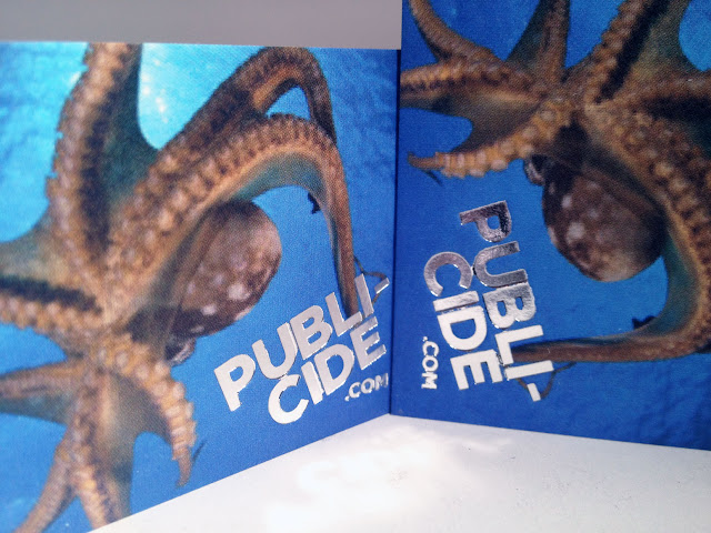
full-colour-cmyk-business-card-high-end-print-design-soho-downtown-nyc

full-color-photo-foil-stamp-business-card-printing-design-downtown-soho-nyc

From the depths department: This full-color CMYK print undersea card turned out looking SO REAL. The light, the water and the dazzling foil stamp make it a little bit hypnotic.

Friday, September 14, 2012

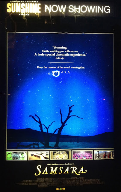
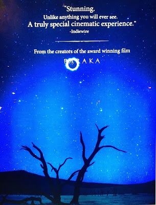
SAMSARA Lightbox Poster


lightbox-movie-poster-printing-nyc
film-industry-poster-printing-ny

lightbox-film-poster-printing-ny
Now playing: our double-sided, double process lightbox movie poster for Samsara, a visually resplendent guided meditation/ documentary on interconnectedness shot in 70mm over five years across twenty-five countries. It’s also a followup to 1992’s cult favorite Baraka. Out now from Oscilloscope Laboratories, Samsara is now playing in NYC at Landmark Sunshine Theater, where we captured these images of the poster glowing last night (complete with quintessentially downtown paint marker tag on the lightbox frame.)

Monday, August 27, 2012

Flawless Black Cards

foil-stamp-letterpress-business-card-best-printer-nyc

Black foil stamp on black stock = a flawless black business card.

Friday, August 24, 2012

Denise

downtown-nyc-art-nolan-hendrickson-design-letterpress-soho-publicide
“Denise,” by Nolan Hendrickson for Publicide Inc, from the Lady Cards series. Original design, offset printing on #130 ecru felt.


Monday, August 20, 2012

SHUT UP AND PLAY THE HITS Poster


lcd-soundsystem-movie-poster-publicide-inc
Our double-process, double sided lightbox movie poster for Shut Up and Play the Hits, the intimate documentary from Oscilloscope Labs examining LCD Soundsystem's ceremonious last hurrah, shown here in the wild at its limited run at IFC Center. 

Wednesday, August 15, 2012


letterpress-stationery-engraved-downtown-nyc-soho-tribeca

Today’s Get The Look is dedicated to chef Julia Child, who was born 100 years ago today. (Respect to the always amazing Letterheady for posting Ms. Child’s delectable circa-1982 letterhead!)

This stationery must be from when Julia was spending time on The Continent, as it is European A4 sized. The script appears hand-engraved, exuding old-world elegance, while the simple line art graphic of saucepans and potatoes charmingly references cookbook illustrations. You can practically smell the potato and leek soup simmering, an effect we’re sure Julia expressly intended for all of her important missives.

HOW TO GET THE LOOK:
  • Paper: Mohawk 70# Text in Linen Restful Blue
  • Inks: Engraved in Dark Blue (Reflex Blue or Pro Blue would be a close match)
  • Font: Hand engraving. Barring that, “Quill” is a virtually identical script typeface.
  • Artwork: Line art illustration

best-letterhead-printing-downtown-NYC-publicide
The French Chef, dreaming up her next Memo

Tuesday, August 14, 2012

Last week Publicide took a field trip to the Wooster Enterprises exhibit at Churner & Churner gallery in Chelsea, lured by the unprecedented opportunity to see the cult line of 70’s Fluxus-influenced paper ephemera shown in its entirety.

concept stationery
Hand in Glove, George Maciunas, 1973/77
publicide letterpress blog
George Maciunas, Torso in Fur stationery, 1973/77
publicide blog experimental greeting cards wooster collective
This is an All Occasion Card and This is an Anniversary Card, 1977

Wooster Enterprises was an experimental design company founded by artists Jaime Davidovich and Judith Henry in Soho in 1976. With help from friends in the Fluxus art movement like George Maciunas and Yoko Ono, they created winking, idiosyncratic stationery, greeting cards, postcards, envelopes, masks, confetti, and other goods. Unfraid of a high-brow gag, their products touched on themes of inversion (“Things To Do” and “Things Not To Do” stationery, “I Hate To Write” notepaper), text-art self-referentialism (“This Is An Anniversary Card”), grotesquerie (an apron printed with human organs, a paper face mask with a violent finger-stretched rictus grin) and trompe l’oeil (crumple-print paper, a postcard printed to look like an envelope.) 

publicide downtown custom printing nyc postcard
Envelope Postcard, 1977
 custom stationery wooster collective soho fluxus paper printing publicide blog
Things To Do/ Things Not To Do two-pad set, 1977
paper mask grotesque george maciunas publicide blog
George Maciunas, Grotesque Face Mask, 1973
fluxus art churner and churner paper exhibition publicide inc
installation view
concept stationery wooster enterprises custom paper design publicide inc
the iconic Crumpled Paper stationery, 1976
avant paperie downtown printing churner and churner gallery publicide blog
display case housing the Wooster Enterprises greatest hits 
wooster enterprises show publicide inc letterpress blog
installation view: crisp white gray and yellow
wooster enterprises churner and churner gallery
love the name of this store on this funfetti-heavy invoice: SHENANIGANS
Though the products were conceptual, the playfully minimal designs were appealing enough to commercial sensibilities that they became a hit in gift shops, blurring the line between art and commerce and setting the blueprint for designey museum-store gifts thereafter. For a moment, coinciding with the rise of downtown art culture in Soho, Wooster Enterprises was hot, as gift shop invoices included in the exhibition attest. But as a sustainable business, Wooster Enterprises only lasted two years, their output--and Henry and Davidovich's art-as-commerce experiment--largely forgotten to time. But what a thrill to see the original experimental paper goods brought out of retirement and looking sleek in a palette of whites, grays and yellows, expertly displayed in bright class cases and across the walls. The collected invoices papering the walls are a bonus treat in themselves, featuring a wealth of kooky ’70s gift shop names like “Nancy Fancy Inc”, “Shenanigans,” “That Personal Touch,” and “Serendipity.”) 
Wooster Enterprises remains up at Churner and Churner, at 205 10th Avenue through Friday. Go! 

Monday, August 6, 2012


best-business-cards-nyc

printing-design-manhattan-envelopes

best-print-shop-custom-design-downtown-manhattan

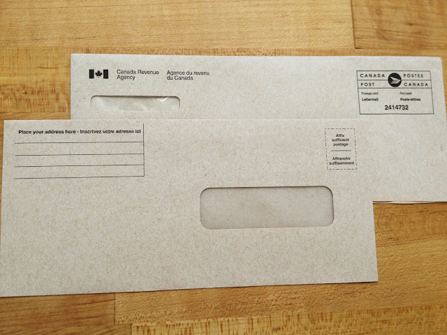
DESIGN SHOUT OUT: Here at Publicide we take great pleasure in encounters with well-designed paper accoutrements, especially those hardworking products you stumble across in everyday life that lend a satisfying touch of class and beauty to the most quotidian moments. Today, we salute the Canadian government for the stellar design on this Canada Revenue envelope set! Printed on smooth kraft paper in a calm sans-serif font, the spare design screams “efficiency” while the subtle Canada Post logo and bilingualism purr “elegance”. Clean rule lines inviting you to “inscrive votre addresse ici” finish off the experience. Thank you Canada for this design moment!
HOW TO GET THE LOOK:
Business Correspondence #10 Envelopes
Size: 4.125” x 9.5”
Paper: 70# Kraft Text
Inks: Offset Black
Font: Choose a tidy official sans-serif like Akzidenz Grotesk 
Could bureaucracy-chic inspired envelope sets be the next word in custom invitations? We certainly think so! Stay tuned.

Thursday, August 2, 2012

Letterpress Life

Photographer Chloe Crespi documented a day in the life at our Soho print shop in the sky. Check out the whole set to see our beautiful space and lots of greased-up original Heidelberg action. #LetterpressLife


Monday, July 30, 2012

Publicide and Sir New York at PROJECT

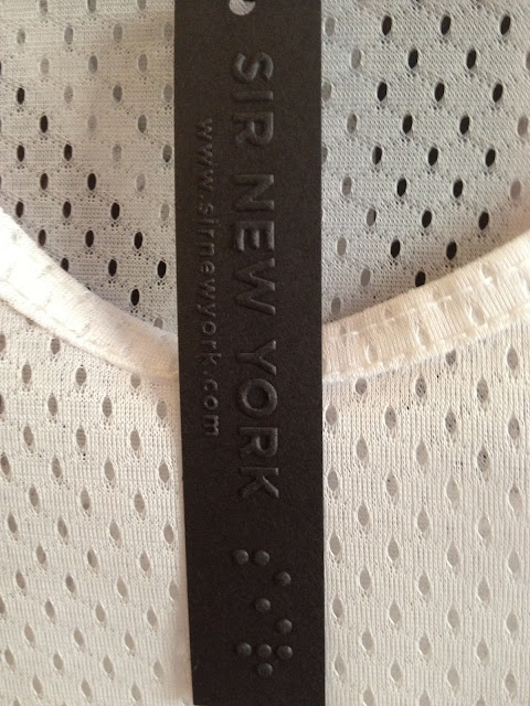
Designer printing! We went to the thick of the action at the Project New York fashion tradeshow to check out the Sir New York booth all decked out with hang tags and business cards by Publicide. Black business cards and hang tags blind-embossed with the subtle Sir New York braille logo perfectly complement the provocative jock minimalism on display in this sports-themed menswear collection, which features specially-designed graphic prints, mesh, luxe custom knits, baseball stripes, sports-inspired cuts and even a Friday Night Lights reference. Publicide relishes helping our creative and discerning clients realize their printing visions!
emboss business card
Crisp blind embossing on black pops against Sir New York white mesh!
fashion printing nyc
the Sir palette: safety orange and original b&w print designs
Fancy blind emboss with the SIR braille logo on special black cardstock by Publicide
summer essential: the SIR fitted cap  
Hang tags on the rack. It's all in the details at Sir NY. 
original print closeup
luxury business cards new york
for the Friday Night Lights lovers, a shout-out to the ultimate coach
Booth mascot
We love the way Sir designer Auston Bjorkman's winking names for each piece (the Second Base Tank, the Pop-Up Fly, the Slugger, the Baller, the Short Stop, the Deuce) reflect the clothes' come-hither athleticism, making this a true concept collection. Apparently, so did the fashion-obsessed rappers in NYC's A$AP Mob, who stopped by the Sir booth to try on shorts and big-up the prints while being filmed for a GQ Magazine segment. In the video they also profess their love for "dark colors and all-black." Wonder if A$AP Mob need some custom all-black cards as well?