Monday, August 27, 2012
Friday, August 24, 2012
Denise
 |
| “Denise,” by Nolan Hendrickson for Publicide Inc, from the Lady Cards series. Original design, offset printing on #130 ecru felt. |
Monday, August 20, 2012
SHUT UP AND PLAY THE HITS Poster
 |
Our double-process, double sided lightbox movie poster for Shut Up and Play the Hits, the intimate documentary from Oscilloscope Labs examining LCD Soundsystem's ceremonious last hurrah, shown here in the wild at its limited run at IFC Center..jpg) |
Wednesday, August 15, 2012
Today’s Get The Look is dedicated to chef Julia Child, who was born 100 years ago today. (Respect to the always amazing Letterheady for posting Ms. Child’s delectable circa-1982 letterhead!)
This stationery must be from when Julia was spending time on The Continent, as it is European A4 sized. The script appears hand-engraved, exuding old-world elegance, while the simple line art graphic of saucepans and potatoes charmingly references cookbook illustrations. You can practically smell the potato and leek soup simmering, an effect we’re sure Julia expressly intended for all of her important missives.
HOW TO GET THE LOOK:
- Paper: Mohawk 70# Text in Linen Restful Blue
- Inks: Engraved in Dark Blue (Reflex Blue or Pro Blue would be a close match)
- Font: Hand engraving. Barring that, “Quill” is a virtually identical script typeface.
- Artwork: Line art illustration
 |
| The French Chef, dreaming up her next Memo |
Tuesday, August 14, 2012
Last week Publicide took a field trip to the Wooster Enterprises exhibit at Churner & Churner gallery in Chelsea, lured by the unprecedented opportunity to see the cult line of 70’s Fluxus-influenced paper ephemera shown in its entirety.
 |
| Hand in Glove, George Maciunas, 1973/77 |
 |
| George Maciunas, Torso in Fur stationery, 1973/77 |
 |
| This is an All Occasion Card and This is an Anniversary Card, 1977 |
Wooster Enterprises was an experimental design company founded by artists Jaime Davidovich and Judith Henry in Soho in 1976. With help from friends in the Fluxus art movement like George Maciunas and Yoko Ono, they created winking, idiosyncratic stationery, greeting cards, postcards, envelopes, masks, confetti, and other goods. Unfraid of a high-brow gag, their products touched on themes of inversion (“Things To Do” and “Things Not To Do” stationery, “I Hate To Write” notepaper), text-art self-referentialism (“This Is An Anniversary Card”), grotesquerie (an apron printed with human organs, a paper face mask with a violent finger-stretched rictus grin) and trompe l’oeil (crumple-print paper, a postcard printed to look like an envelope.)
 |
| Envelope Postcard, 1977 |
 |
| Things To Do/ Things Not To Do two-pad set, 1977 |
 |
| George Maciunas, Grotesque Face Mask, 1973 |
 |
| installation view |
 |
| the iconic Crumpled Paper stationery, 1976 |
 |
| display case housing the Wooster Enterprises greatest hits |
 |
| installation view: crisp white gray and yellow |
 |
| love the name of this store on this funfetti-heavy invoice: SHENANIGANS |
Though the products were conceptual, the playfully minimal designs were appealing enough to commercial sensibilities that they became a hit in gift shops, blurring the line between art and commerce and setting the blueprint for designey museum-store gifts thereafter. For a moment, coinciding with the rise of downtown art culture in Soho, Wooster Enterprises was hot, as gift shop invoices included in the exhibition attest. But as a sustainable business, Wooster Enterprises only lasted two years, their output--and Henry and Davidovich's art-as-commerce experiment--largely forgotten to time. But what a thrill to see the original experimental paper goods brought out of retirement and looking sleek in a palette of whites, grays and yellows, expertly displayed in bright class cases and across the walls. The collected invoices papering the walls are a bonus treat in themselves, featuring a wealth of kooky ’70s gift shop names like “Nancy Fancy Inc”, “Shenanigans,” “That Personal Touch,” and “Serendipity.”)
Wooster Enterprises remains up at Churner and Churner, at 205 10th Avenue through Friday. Go!
Monday, August 6, 2012
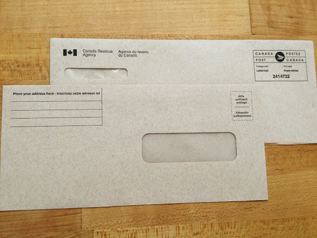
DESIGN SHOUT OUT: Here at Publicide we take great pleasure in encounters with well-designed paper accoutrements, especially those hardworking products you stumble across in everyday life that lend a satisfying touch of class and beauty to the most quotidian moments. Today, we salute the Canadian government for the stellar design on this Canada Revenue envelope set! Printed on smooth kraft paper in a calm sans-serif font, the spare design screams “efficiency” while the subtle Canada Post logo and bilingualism purr “elegance”. Clean rule lines inviting you to “inscrive votre addresse ici” finish off the experience. Thank you Canada for this design moment!
HOW TO GET THE LOOK:
Business Correspondence #10 Envelopes
Size: 4.125” x 9.5”
Paper: 70# Kraft Text
Inks: Offset Black
Font: Choose a tidy official sans-serif like Akzidenz Grotesk
Could bureaucracy-chic inspired envelope sets be the next word in custom invitations? We certainly think so! Stay tuned.
Thursday, August 2, 2012
Letterpress Life
Photographer Chloe Crespi documented a day in the life at our Soho print shop in the sky. Check out the whole set to see our beautiful space and lots of greased-up original Heidelberg action. #LetterpressLife
Subscribe to:
Comments (Atom)


